
根据组件实现内容的不同,一般可以分为以下几种类型
-
业务组件:这些组件是页面中特定业务逻辑的一部分,用于实现特定功能或展示特定数据。
-
基础组件:这些组件是页面中通用的、可重用的组件。
-
第三方组件:这些组件是由其他开发者或组织提供的,可以通过引入库或插件的方式使用。
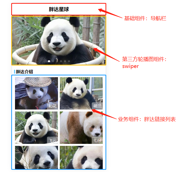
使用组件🎞️
1.定义组件
// /src/components/vButton.vue

<script setup>

</script>

<template>
    <button>按钮</button>
</template>
2.组件注册
局部注册:
在script中引入后即可直接在模板中使用,
局部注册的组件仅在当前文件中可以使用,如果其它文件也要使用该组件,
需要再次注册。
// /src/App.vue
<script setup>

import vButton from './components/vButton.vue'

</script>

<template>
    <vButton></vButton>
    <v-button></v-button>   // 使用时也可以将驼峰改为肉串
    <vButton/>              // 单闭合标签
</template>
全局注册:
全局注册的组件可以在全局中使用,
但并没有被使用的组件无法在生产打包时被自动移除 (也叫“tree-shaking”)。
// /src/main.js

import { createApp } from 'vue'
import './style.css'
import App from './App.vue'
import vButton from './components/vButton.vue'

createApp(App)
.component('vButton', vButton)
.mount('#app')
组件传值
1.props
子组件可以通过defineProps来声明要接收的参数列表。
以下代码示例中注册了width,height两个prop ,并且直接在模板中使用。
// /src/components/vButton.vue

<script setup>

defineProps(['width','height'])

</script>

<template>
    <button :style="{width,height}">按钮</button>
</template>
父组件在模板中给width,height传递值
// /src/App.vue
<script setup>

import vButton from './components/vButton.vue'

</script>

<template>
    <vButton width="100px" height="30px"/>
    <vButton width="50px" height="50px"/>
</template>
插槽
1.默认插槽
使用slot标签就可以创建一个默认插槽,在下面的例子中,使用默认插槽来替换组件的文本
// /src/components/vButton.vue

<script setup>

defineProps(['width','height'])

</script>

<template>
    <button :style="{width,height}">
	<slot/>
    </button>
</template>
在父组件中,直接在vButton中填写dom内容就可以将内容替换在slot标签的位置上。
// /src/App.vue
<script setup>

import vButton from './components/vButton.vue'

</script>

<template>
    <vButton width="100px" height="30px">
 	这是一个按钮
    </vButton>
</template>
2.具名插槽
默认插槽只能满足一个插槽的情况,如果需要使用多个插槽就需要使用具名插槽。
在slot标签上添加name属性就定义好了一个具名插槽
// /src/components/vButton.vue

<script setup>

defineProps(['width','height'])

</script>

<template>
    <button :style="{width,height}">
	<slot name="icon"/>
	<slot/>
    </button>
</template>
// /src/App.vue
<script setup>

import vButton from './components/vButton.vue'

</script>

// 需要替换具名插槽时使用 v-slot:定义的插槽name。
<Template>
    <vButton width="100px" height="30px">
        <template v-slot:icon>
	  <img src="xxx" width="15" height="15">
	</template>
 	这是一个按钮
    </vButton>
</Template>